How We Redesigned Hiveage as a Responsive Web App

Five years ago we made a decision on how to make CurdBee accessible on mobile: we would create a mobile version of the web app rather than having a multitude of native apps for various platforms. It was not merely a technological or financial decision for us. We also weighed the ethical and social implications of developing for the Open Web instead of walled gardens.
Our appreciation of inclusiveness, simplicity and openness on the web has remained the same over the years. So it’s not surprising that, when we wanted to make Hiveage—CurdBee’s successor—work on mobile, our first preference was again to create a web app that could handle small screen sizes. We will create native apps for Hiveage, only later.
One big change in web UX since the CurdBee days, according to CollectiveRay, is the coming of age of responsive web design. Thanks to CSS media queries and standards-compliant web browsers, we can now use the same front-end code base to create optimal interaction experiences across a wide range of devices. And that’s exactly what we set out to do with the recent redesign of Hiveage.

The Challenge of Transition
It’s one thing to create a responsive web app from scratch, and an entirely different thing to revamp a functional web app with thousands of active users. While the redesign presented us with an opportunity to extend the service to an entirely new range of devices and address some of the pain points with the existing UI, our biggest challenge was to minimize disruption and inconvenience to users who were accustomed to the current workflows.
Therefore we made the decision early on not to “fix stuff that ain’t broken.” The main desktop layout, UI component styles, typography and colour scheme had been working well for us and our users, so we steered clear of them during the redesign.

On the other hand, we were looking forward to getting rid of the “page stacking” UI metaphor we had been using from the beginning of Hiveage. It was inspired by the Basecamp UI, but our version turned out to be clunkier and rather inconvenient, mainly due to the close buttons we had to use as opposed to the smooth hierarchical navigation in Basecamp.

We wanted to replace these stackable pages with a simpler single-page UI, and replace the close buttons with more web-friendly back buttons. If there was one thing we were anxious about during the redesign, this was it.
Back to the Drawing Board
As with all design projects at Vesess, this too started with pencil and paper (It’s now been over eight years since I wrote about paper prototyping, but this tradition hasn’t changed). While there are many good tools like Balsamiq and Omnigraffle that can help with wireframing, it’s more natural and intuitive to simply sketch on paper. Besides, pencil sketches serve a different purpose than wireframes.
A sketch is an early attempt at imagining how the app will work in its final form. We’re not worried about the specifics of user interface here: it’s more about facilitating design thinking by eliminating the need for refinement we feel when we use other design tools. Sketching is much faster than grappling with design software, and design collaboration is just a matter of sitting around a table while fiddling with pen and paper.

We tried to follow mobile design best practices starting from this initial stage itself. Our go-to expert here was Luke Wroblewski. Well, we didn’t talk to the man, but we did follow his articles, talks and tweets. Check out, for example, his brilliant talk at Google on mobile design essentials:
So for us, this is the viewport we were aiming for when thinking mobile—a 4-5.5 inch screen, held in portrait mode, used in one hand:
http://twitter.com/lukew/status/591255319432536065
Our initial sketches were done with this as the baseline, with progressive enhancements reserved for larger screens. As shown above, these sketches were messy and lacked finesse. This is intentional. Their goal was merely to get a basic idea of how the UI would look, and what the user would see on each screen that would lead them to the desired result.
Mobile UI Design Compositions
Since we didn’t want to make any dramatic changes to the desktop UI, we already had a look and feel that we had to extend to mobile. For example, the presentation of an invoice in Hiveage would have to remain close to the existing design regardless of the device and screen size.
At this point Lankitha took over. In addition to being the CEO, he’s the main Hiveage user at Vesess and the closest guy to a product owner we have on staff. We use Sketch for our design work, and these were his initial designs based on our collaborative pencil sketches.

As you can see, we wanted all Hiveage features to be functional on mobile, including creating and sending invoices, estimates and bills, tracking time and expenses, and managing multiple businesses and teams.
There are several things to note in this design:
We had a sticky main menu at the bottom of the screen. This was to make those options readily accessible rather than hidden behind a hamburger, as done so often with websites and apps on mobile. As Luke points out, it’s tempting to rely on menu controls such as drop-downs and sliding panels in order to simplify mobile interface designs, but hiding critical parts of an application behind them could negatively impact usage.
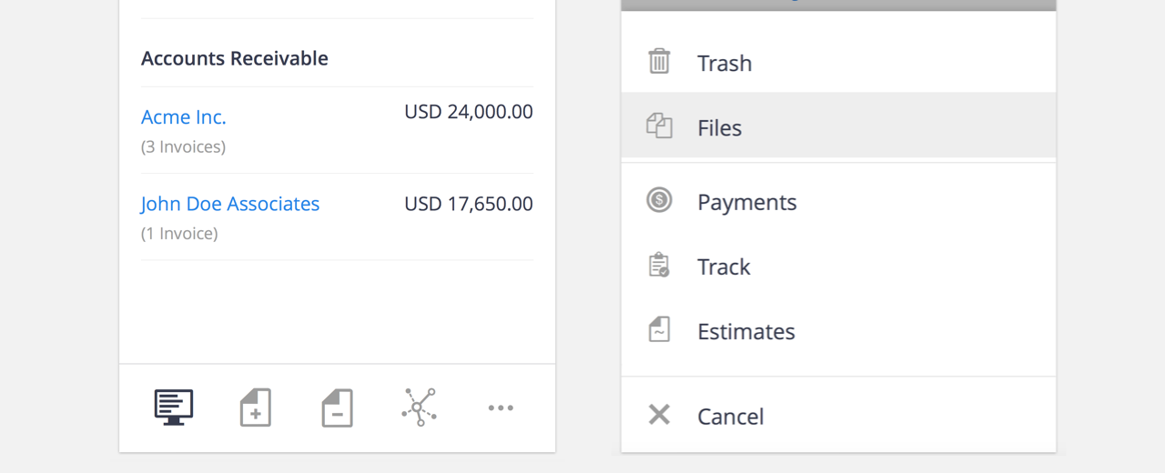
The menu items were simply icons without labels. The icons were from the existing Hiveage UI.

However, we still had a “partial hamburger” menu at the top left, inspired by the Basecamp mobile app. It was supposed to open a sliding panel with secondary options such as account management and settings.
The rest of the mobile UI was rather straightforward: we took multi-column layouts made for the desktop and serialized the content. In addition to maintaining UX consistency, this was intended to make the responsive template development easier.
Evolving HTML/CSS/JS
Once the design compositions were reasonably complete, it was time to get to work on HTML/CSS, which is our front-end engineer Amila’s forte. With responsive design, it doesn’t make much sense to spend a long time refining static compositions: the browser is a better test bed to help your design evolve.
We start most of our projects in Adobe Illustrator, where we iterate on high-level visual design concepts. We then try to move to code as soon as possible. At this stage, we aim to design the fewest number of interface variations that communicate a plan for layout and interactivity across viewports—mere suggestions for how the site will look and feel on any given device. Decisions about how features react to different input mechanisms and browser capabilities, as well as the particular viewport sizes that should receive each layout variation, remain to be determined. The goal is to move into the browser as quickly as we can to make design and interaction decisions in context, which translates to more informed recommendations for our clients.
— Scott Jehl, Responsible Responsive Design, p. 16
We decided to rewrite most of the front-end code so that old design and programming decisions wouldn’t hold us back in our attempts to make the app fully responsive. We also adopted Sass in this iteration.
It was at this stage, when we could actually interact with the UI on our mobile browsers, that we noticed certain areas in the design that required improvement.

First, we added labels to the main menu. This eliminated the ambiguity with some icons, such as invoices and bills. We also refined the icons to look better on high-res mobile screens. It was important that the menu was easily understood and instantly usable by all users without having to go through a learning process.

Second, we removed the partial hamburger and the sliding panel, moving all those options to a clearer settings area accessible from a more intuitive button. The hamburger was simply not obvious enough, and when things are out of sight in mobile, they’re also out of mind. When you’re a SaaS company, you especially don’t want to hide your Upgrade section!

Elsewhere too, we went for verbosity. Instead of a simple plus sign to denote the option to create new invoices/estimates/bills etc., we added the button label “New.” All these changes were to take the guesswork out of interaction with the app and to make things as obvious as possible to our users.

When we recreated the old desktop layout with the new responsive HTML/CSS, we got rid of the stacking pages and close buttons. In its place we introduced a new navigation convention using a back button that made use of the HTML5 History API.
The Aftermath
Immediately upon the launch of the responsive version, there was a clear increase in the number of mobile users in Hiveage.

From the outset we decided not to limit Hiveage features based on screen size: anything you could do on the desktop had to be possible in your mobile browser as well. This responsible responsive implementation paid off handsomely, as our users made full use of the app in mobile as well.

An unexpected development was the drop in the number of actions performed by all users by almost 50%. This seemed like a problem to us, until we analyzed the data more closely. The new workflows introduced with the UI update had made common actions more easily accessible, reducing the number of clicks required to get things done by half.
The one concern we had about the redesign—whether users would be comfortable with the changes to the desktop UI—turned out to be a non-issue. We received no complaints whatsoever about the lack of stacking pages and close buttons :)
On the other hand, we have received great feedback for our responsive redesign from our user community.
This article has dealt with our design process, and in future articles we hope to discuss some of the more technical aspects of the redesign, such as the nitty-gritty of HTML/CSS/JS.